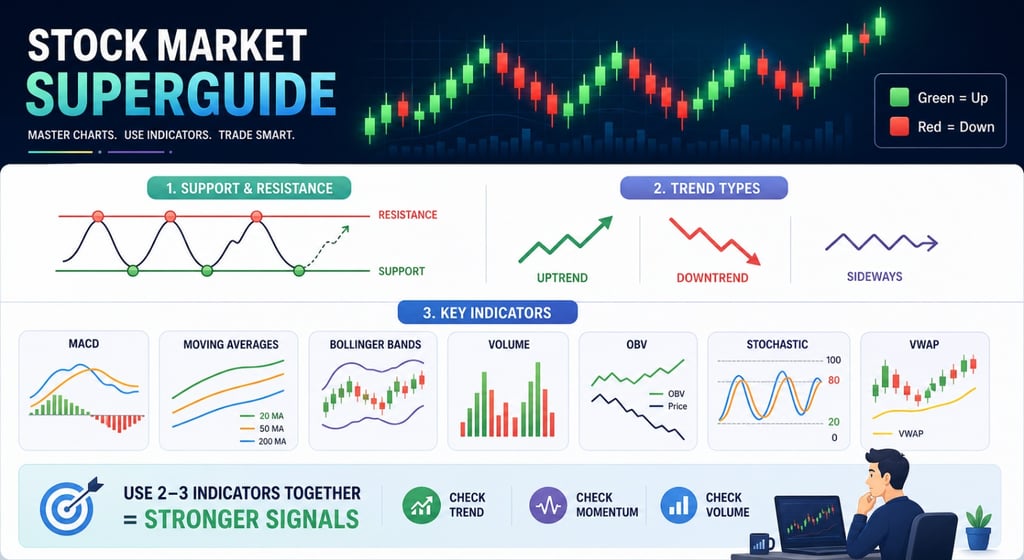
Stock Market Superguide!
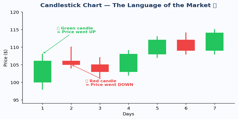
First, every price chart is made of little things called candlesticks. Green ones mean the price went UP that day. Red ones mean the price went DOWN. Now you know the very basic of stock market.
4/19/20269 min read
Stock Market Superguide!
First, every price chart is made of little things called candlesticks. Green ones mean the price went UP that day. Red ones mean the price went DOWN. Now you know the very basic of stock market.
Candlestick Chart Green = Up, Red = Down
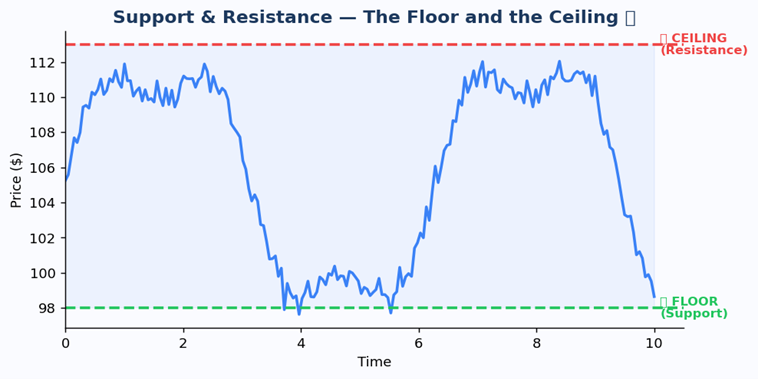
Second, every chart has a floor and a ceiling. The floor is called Support, and the ceiling is called Resistance. The price bounces between these two. Keep those two words in your brain to understand the further points better.
Support (Floor) and Resistance (Ceiling) The price bounces between them like a ball!
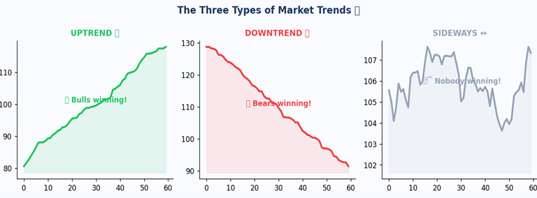
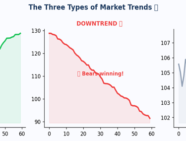
The Three Types of Trends Uptrend, Downtrend, and Sideways
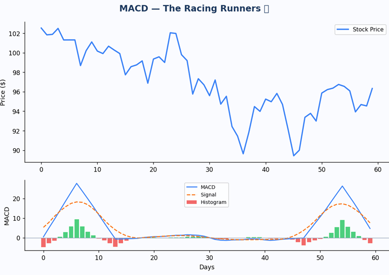
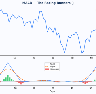
Indicator #1: MACD The Racing Runners
Okay, so imagine two runners in a race. One is fast that is the short-term runner, and he looks at the last 12 days of prices. The other one is a bit slower he looks at the last 26 days. The MACD just watches how far apart these two runners are.
MACD stands for Moving Average Convergence Divergence. When the fast runner gets way ahead, the stock has a ton of energy. When they are running close together, something is about to happen.
Full MACD Chart Price on top, MACD histogram and lines below
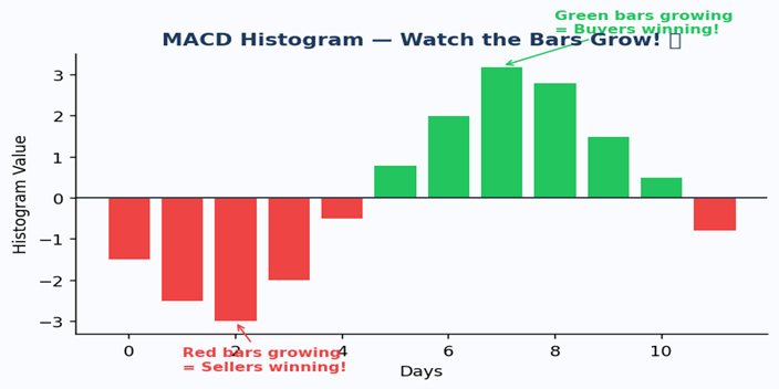
The histogram bars
When the green bars are growing, it means buyers are getting stronger and the fast runner is pulling ahead. When the red bars are growing, sellers are taking over. When the bars start shrinking no matter what colour the trend is running out of steam!
MACD Histogram Green bars = buyers winning, Red bars = sellers winning
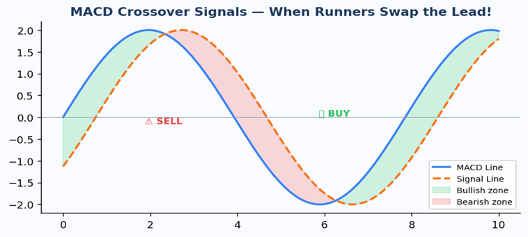
The crossover signals
A bullish crossover is when the MACD line jumps above the signal line that is a buy signal. A bearish crossover is when the MACD line falls below the signal line that is a sell signal.
MACD Crossover Signals BUY when lines cross up, SELL when they cross down
Example: Think of MACD like a video game health bar. When your hero gains health fast, the green bars grow and your hero is getting STRONGER. When health starts dropping and the red bars grow, watch out the villain is winning.
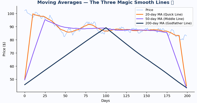
Indicator #2: Moving Averages
A Moving Average just takes the average price over a bunch of days and draws it as a line. It smooths out all the crazy daily jumps so you can see what is really happening.
The Three Moving Average Lines 20-day (quick), 50-day (middle), 200-day (godfather)
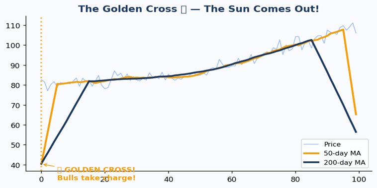
The two most famous signals
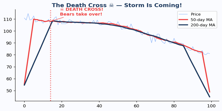
The Golden Cross is when the 50-day line crosses above the 200-day line. The bulls are in charge and can be considered as a good time to buy the stock.
The Golden Cross 50-day MA crosses above 200-day MA = Bullish!
The Death Cross is when the 50-day line crosses below the 200-day line. The bears have taken over. Now, you should be careful, a death cross does not always indicate you should sell the stock.
The Death Cross 50-day MA crosses below 200-day MA = Bearish!
Example: Imagine tracking how many candies you eat each day. Some days you eat 2, some days 10. If you average the last 20 days, you get a smooth number that shows your REAL candy habit not just today's sugar rush. Moving Averages do the exact same thing for stock prices!
Indicator #3: Bollinger Bands
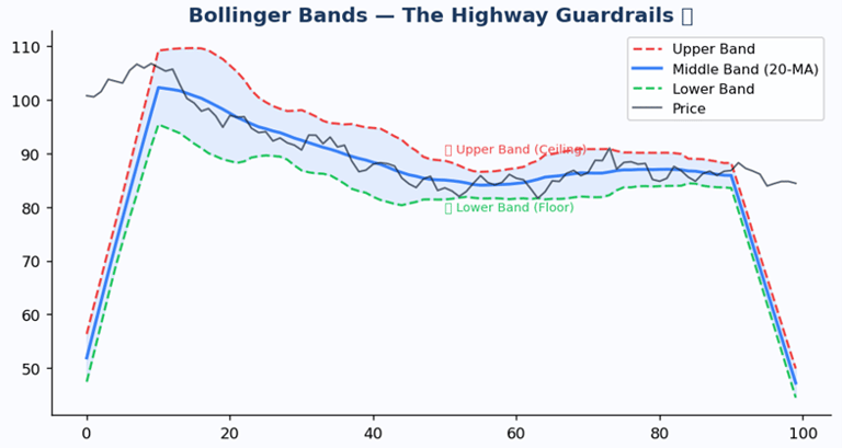
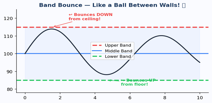
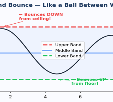
Bollinger Bands have three lines. There is a middle line, which is just the 20-day Moving Average. Then there are two outer bands on either side. These bands stretch wider when the market is going crazy and squeeze closer when things are calm and boring.
Bollinger Bands Upper band (ceiling), middle line, lower band (floor)
The bounce
When the price touches the upper band, It is most likely that the stock has reached it’s maximum potential and will drop down soon. When the price is hanging around the middle, everything is normal. When the price touches the lower band, it often bounces back up.
Band Bounce The price bounces like a ball between the upper and lower bands
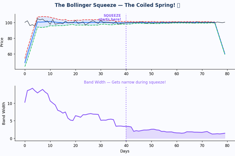
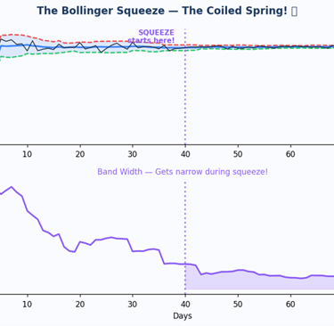
The Squeeze
When the bands get super narrow and squeeze together, the market has gone very quiet. That quiet almost always means a big move is about to happen. Smart traders wait to see which direction the first big candle breaks out before jumping in.
The Bollinger Squeeze Bands get tight like a coiled spring, then BOOM!
Example: Imagine a pinball game. The ball bounces between the left wall and the right wall. When the walls squeeze together BOOM the ball shoots out super fast! That is exactly what the Bollinger Squeeze looks like!
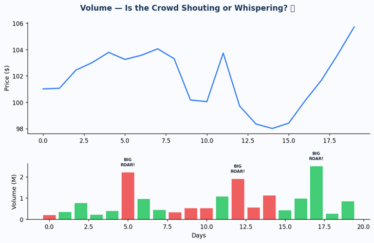
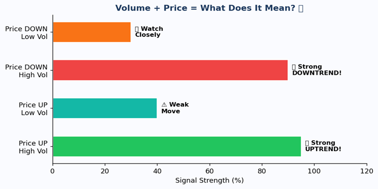
Indicator #4: Volume
A volume indicator measures the total number of shares or contracts traded for a financial instrument over a set period, indicating the intensity behind price movements. High volume shows strong interest, validating trends, while low volume suggests weak interest.
Volume Chart Big bars = lots of people trading = important move!
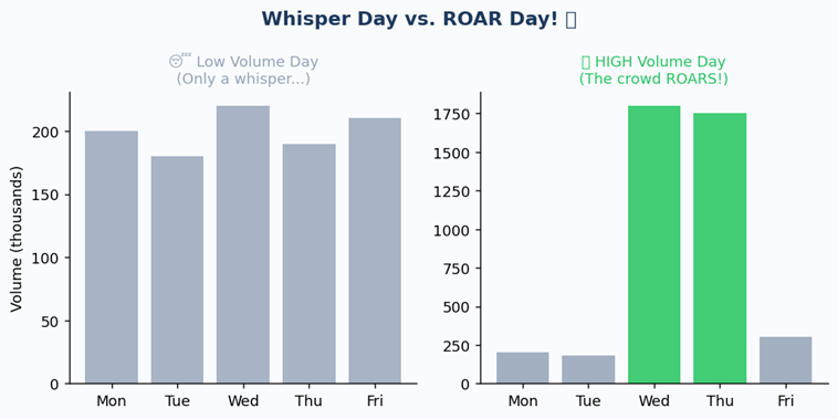
Whisper days vs. ROAR days
Whisper Day vs ROAR Day High volume days are the ones that matter!
When the price goes UP on HIGH volume, that is a real roar, The uptrend is strong.
When the price goes up on LOW volume, that is just a whisper and it might not last.
When the price goes DOWN on HIGH volume, danger, The bears are very serious.
When the price goes down on low volume, the sellers are weak and the price might bounce back soon.
Volume + Price Direction What each combination means for traders
Example: At a concert, when one person starts clapping, nobody cares. But when the whole crowd claps together, it is excellent. Volume is the crowd at the stock market concert. A price move without volume is like clapping alone not very convincing!
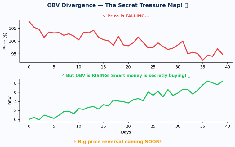
Indicator #5: OBV
OBV stands for On-Balance Volume, and it keeps a running score of buying power vs. selling power. Here is how it works. On days when the price goes UP, it adds that day's volume to the total. On days when the price goes DOWN, it subtracts that day's volume. So if the OBV line is rising, it means buyers are sneaking in quietly even if the price looks flat.
OBV Chart Rising OBV means buyers are in control, even if the price looks quiet
The secret weapon OBV Divergence
When the price is going down but OBV is going up, it means smart investors are secretly buying. The price will probably follow OBV and shoot up soon. This is one of the most reliable signals you can find.
OBV Divergence Price falls but OBV rises = secret buying = big move coming!
Example: Imagine a school election. The popular kid says everything is fine and everyone loves him. But secretly, everyone is voting for the quiet kid. On election day surprise the quiet kid wins! OBV shows you who people are really voting for with their wallets.
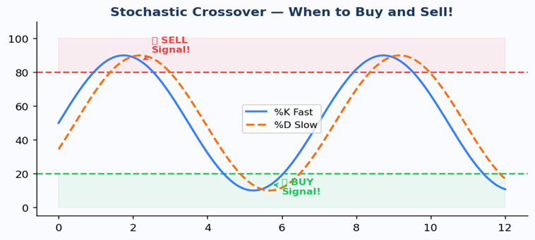
Indicator #6: Stochastic Oscillator
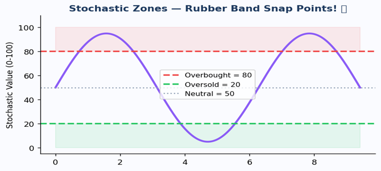
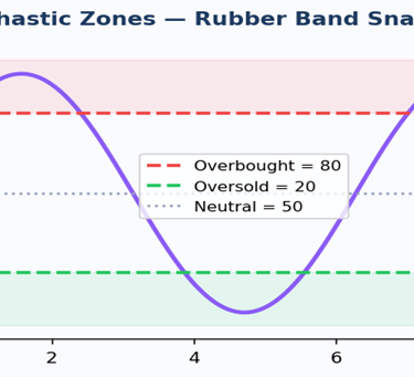
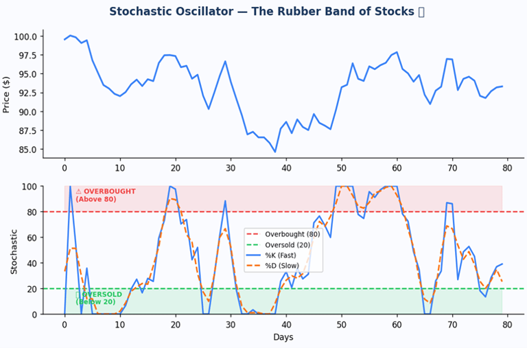
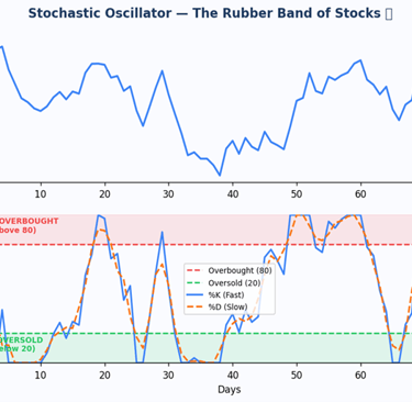
The Stochastic Oscillator tells us when a stock price has been stretched too far from its recent highs or lows and is about to snap back. It measures where the current price sits compared to the highest and lowest prices over the last 14 days. It moves between 0 and 100. Above 80 means the price has been stretched too high. Below 20 means it has been stretched too low.
Stochastic Zones Like a rubber band, prices snap back from extremes
The two lines and the signals
There are two lines inside the Stochastic. The fast line is called %K and the slow line is called %D. When these two lines cross each other inside the overbought or oversold zones, that is your signal. This is much more reliable than a crossover in the middle of the chart.
When the fast line crosses above the slow line in the oversold zone (below 20), that is a buy signal, The rubber band is snapping back up. When the fast line crosses below the slow line in the overbought zone (above 80), that is a sell signal the rubber band is snapping back down.
Stochastic Oscillator Chart %K and %D lines with overbought/oversold zones
Stochastic Crossover Signals BUY in oversold zone, SELL in overbought zone
Story time: Imagine a basketball game. Your team scored 90 points in the first quarter way above their usual pace. You just know they cannot keep that up. Sure enough, next quarter they only score 60. Stochastic tells you when a stock is playing at an unsustainable pace and is about to slow down!
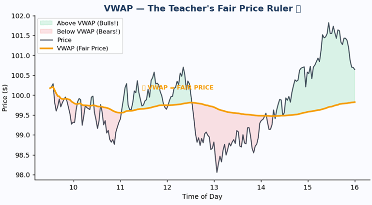
Indicator #7: VWAP
It tells you the true average price based on how many shares were traded at each price throughout the day.
VWAP stands for Volume-Weighted Average Price. Professional traders , big banks and fund managers use it as their measuring stick for a fair price. If you buy below VWAP, you got a deal. If you buy above VWAP, you paid more than the day's average.
VWAP Chart Golden line is the fair price. Green zone = bulls, Red zone = bears
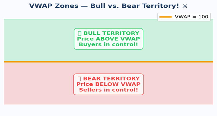
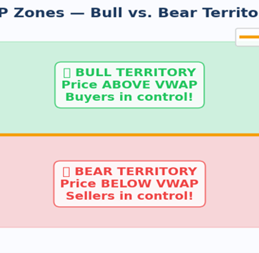
The VWAP zones
When the price is ABOVE VWAP, buyers are in control. It is the green zone and the bulls are winning! When the price is below VWAP, sellers are in control. It is the red zone and the bears are winning.
VWAP Bull vs Bear Territory Above = buyers in charge, Below = sellers in charge
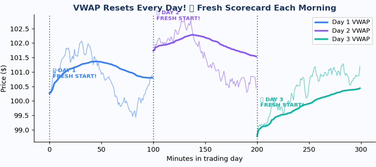
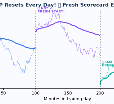
Difference between MA and VWAP
Here is something special about VWAP that makes it different from Moving Averages. VWAP resets every single trading day at the opening bell. Moving Averages look at many days all at once, but VWAP only cares about today
.
VWAP Resets Daily Each new day gets a fresh start, like a new scorecard
Example: Imagine going to a vegetable market. Some stalls sell tomatoes for Rs. 20, some for Rs. 25, and some for Rs. 18. VWAP calculates the true average based on how many tomatoes were sold at each price. Buy below VWAP and you got a deal! Buy above and you overpaid!
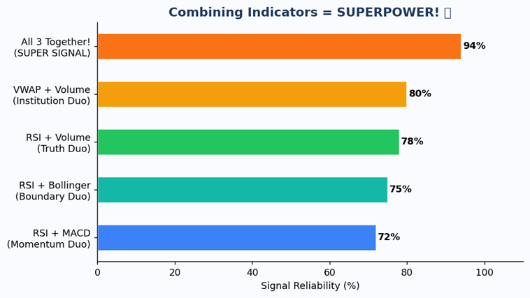
Combining Indicators
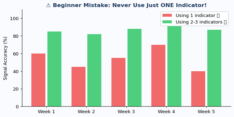
Indicators are way more powerful when they work together. When two or three indicators all agree on the same thing, you have a SUPER SIGNAL that is much more reliable than any single indicator alone.
Combining Indicators The more they agree, the more reliable the signal!
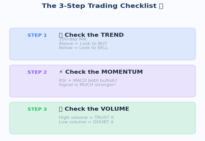
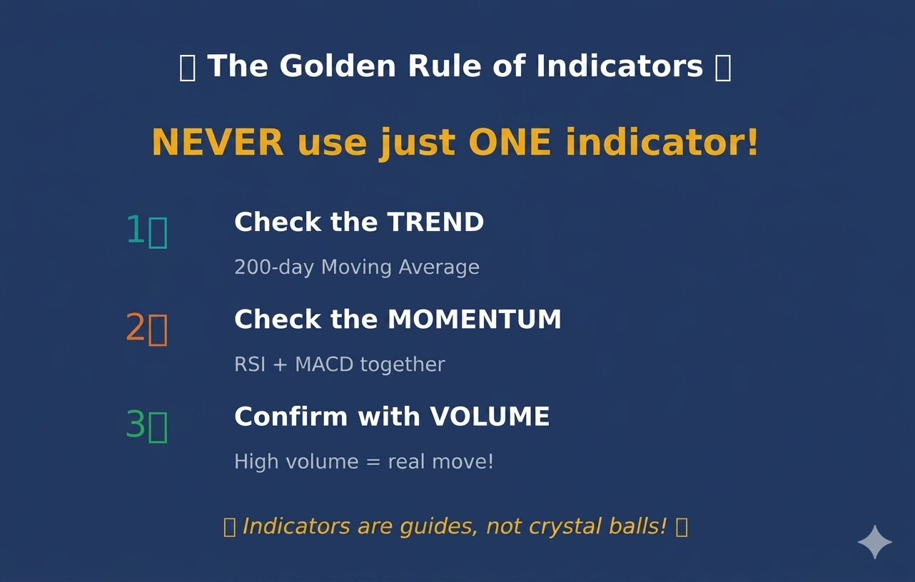
The 3-Step Trading Checklist
The 3-Step Checklist Trend, Momentum, Volume
Step 1-Check the Trend. Is the price above or below the 200-day Moving Average? Above means look for buy signals. Below means look for sell signals.
Step 2-Check the Momentum. What are RSI and MACD saying? If both are bullish, the signal is much stronger!
Step 3-Check the Volume. Is the crowd confirming the move? High volume means trust it. Low volume means doubt it!
Beginner Mistake Using 2-3 indicators is WAY more accurate than using just one!
Summary
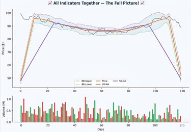
Now let's look at everything on one chart. When you put Moving Averages, Bollinger Bands, and Volume together, you get a really full picture of what a stock is doing. Each indicator tells you a different part of the story.
All Indicators Together Moving Averages, Bollinger Bands, and Volume on one chart
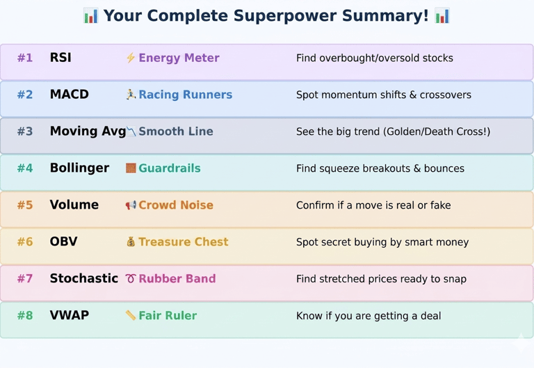
Complete Summary All 8 indicators and what they do
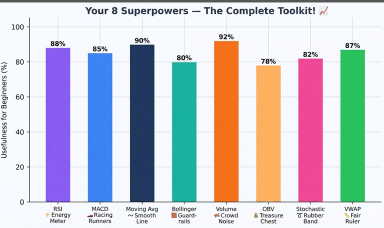
All 8 Indicators Ranked by usefulness for beginners
The Golden Rule of Indicators
Never use just one indicator, The best traders combine 2 or 3 indicators that work together. Try RSI plus MACD plus Volume as your starter combo. They will confirm each other and help you avoid fake signals. Remember indicators are guides, not a clear path.